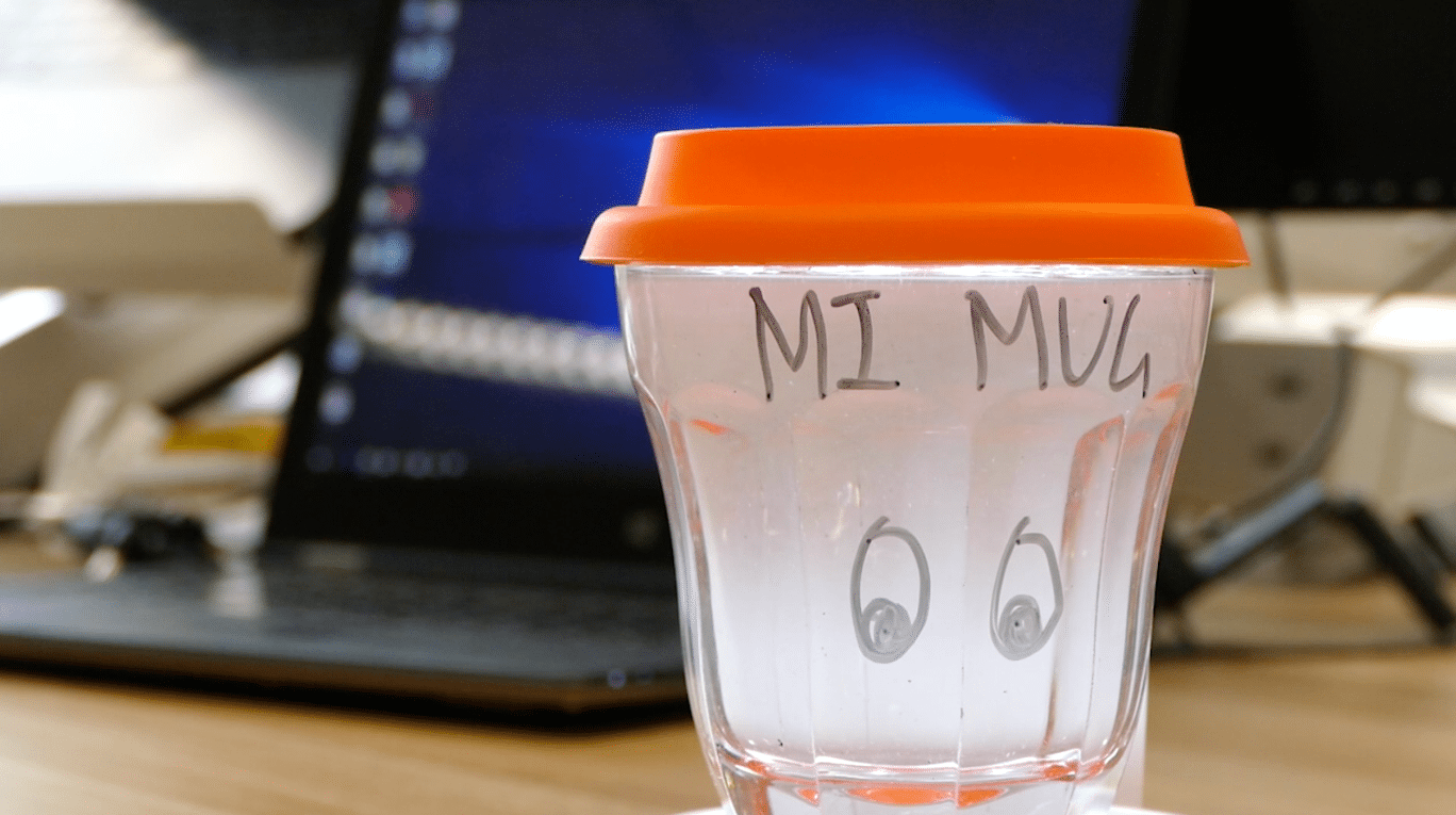
Mi-Mug
The EyeDeal Mug - A Friendly Screen-break reminder for the Eyes
Context:
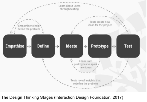
A University group project where we utilised the design thinking process to conduct user research, conceptualise and prototype a product idea relating to healthcare. Our team chose the topic: Eye health.
Group members:
Peggy Liu, Andre Li, Derek Chu
My Role:
UX researcher, Prototyper, Concept Video director
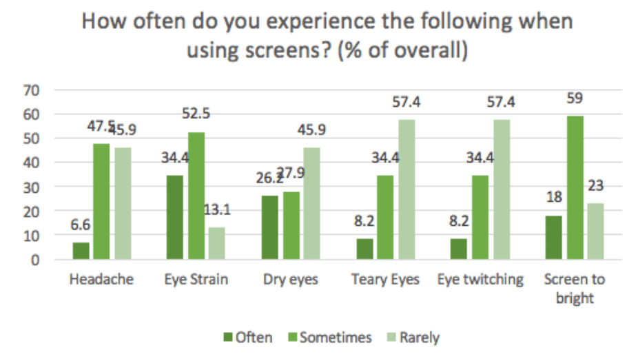
Eye diseases and conditions and develop at all ages many of which progress with little or no symptoms in vision. Patients with myopia (short-sightedness), which is the most common vision problem, are at higher risk of developing other eye diseases .
One demographic most susceptible to environmental and occupational factors detrimental to eye health are white collar workers who typically work in an indoor office setting with a large amount of screen time. The age group 20-30 is the stage where those with myopia would have started to see a stabilisation in there myopic degree. It also when a majority have entered the workforce
Research shows that the increase in time spent look at screens, or more broadly at close up work has been a factor leading the the increase in myopia. Hence the challenge is to encourage and empower this group of young professionals to be more active participants in their eye health to improve the quality of life in the later stages.
To find out the enablers and barriers to more active participation to eye health through researching the target group’s eye care behaviours, eye health knowledge, eye health awareness and eye care experiences.
Our target group for the interviews:
A total of 13 participants were interviewed (7 female, 6 male) aged 22-29. In addition, 2 optometrists in training at an optometrist were interviewed to gain more understanding about optometrist visits and eye health.
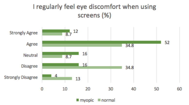
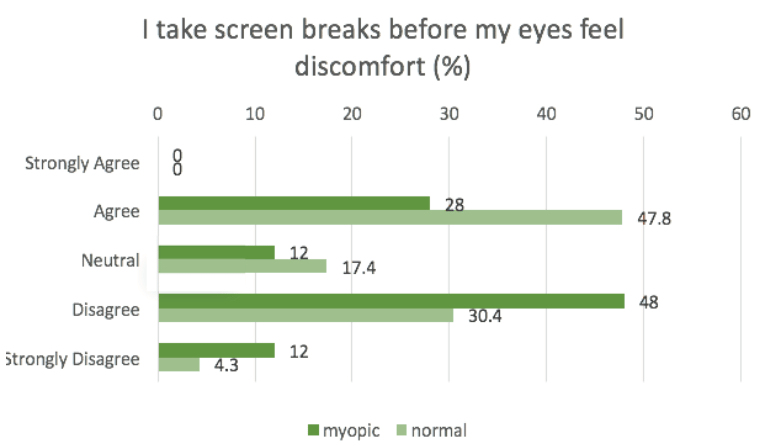
After the qualitative analysis of the interview findings, a questionnaire was conducted to obtain some statistics about the behaviours and knowledge of eye health of 20-30yr old young professionals. The aim was to confirm to validate the qualitative findings as well as survey the focus group. The responses of both those with and without myopia were collected to find out if there were differenced in these behaviours and attitudes.
A total of 61 responses were obtained (44% Normal Vision, 56% myopic)
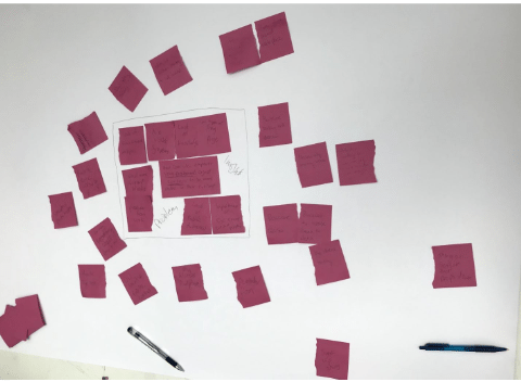
We also analysed the quantitative data obtained using excel and using Python with the Pandas and Numpy libraries. These findings along with quotes from both the interviews and questionnaires were written on sticky notes to create an affinity diagram.
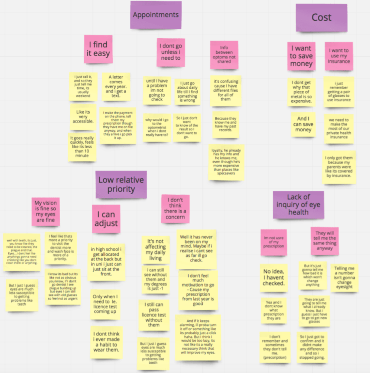
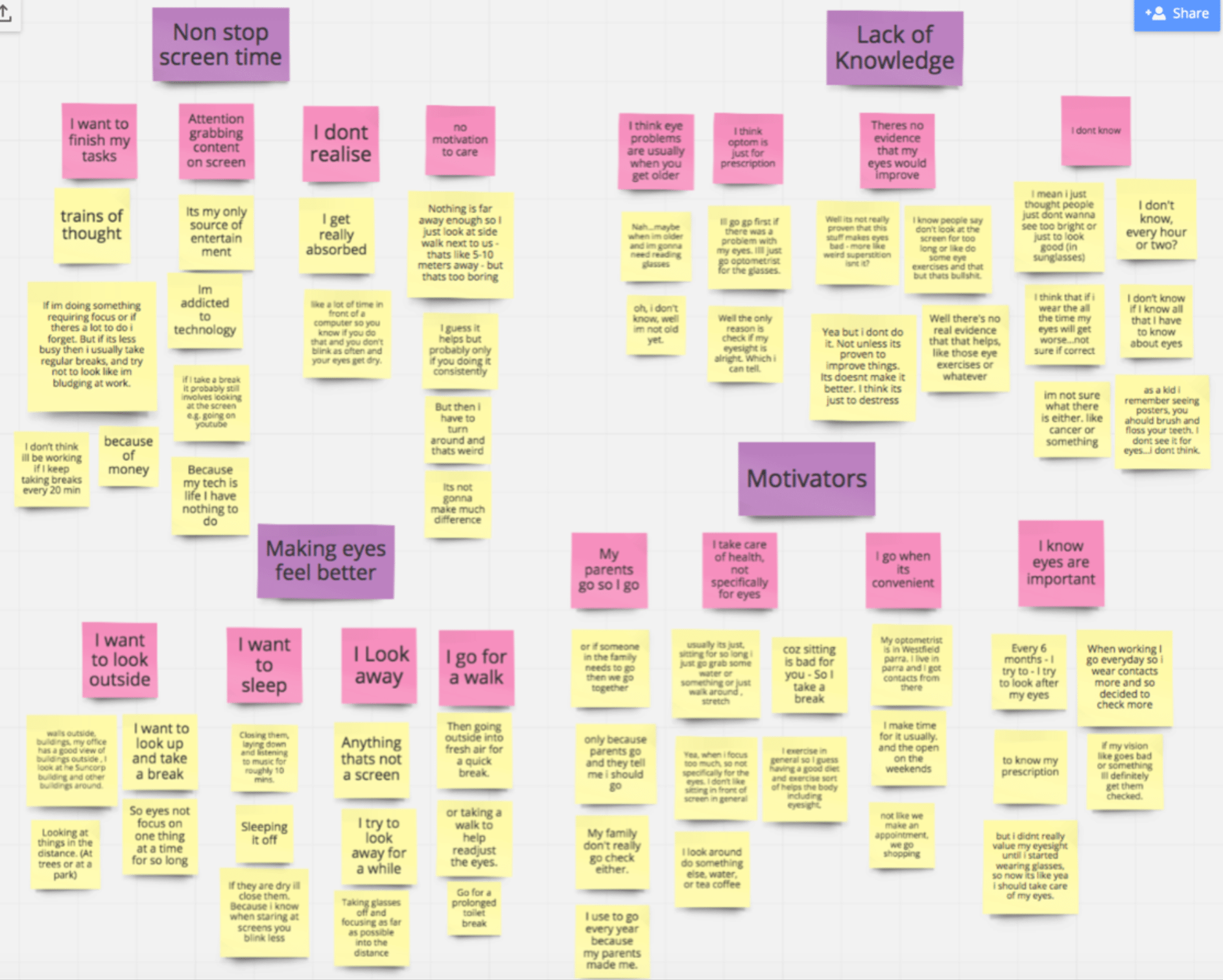
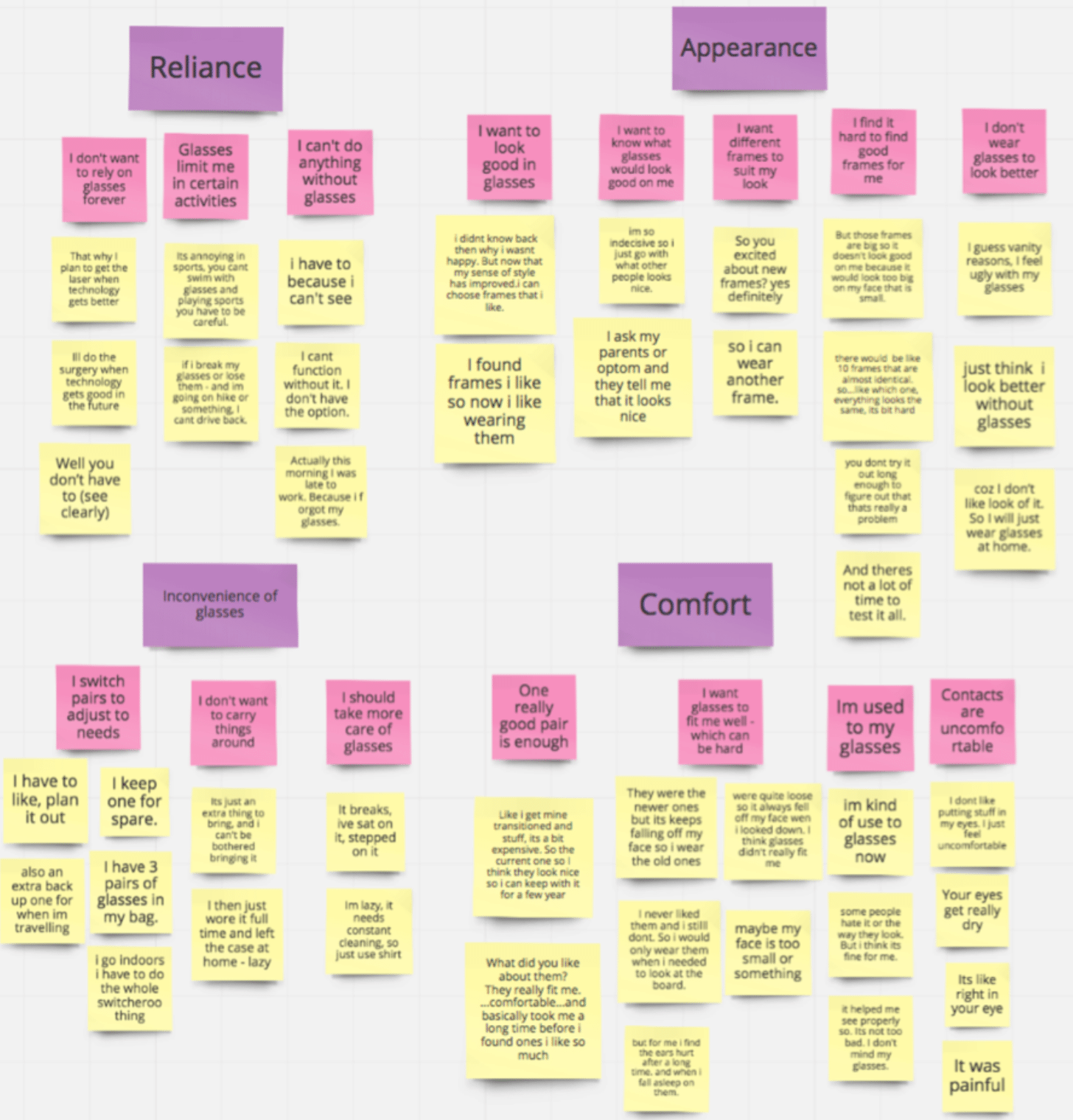
As the data collected on "Eye Health" was quite broad, our Affinity Diagram revealed 3 main areas of knowledge that we were able to gain:
From the three main areas above we evaluated the insights, design opportunities and needs discovered against the brief. We decided that the second area (Motivations and behaviours towards eye care) would be most appropriate for the brief to "empower young professionals" and to motivate them to be more '"active participants". From the findings in the second area, we further analysed the design opportunities and settled on two points to focus on:
They value their eyesight, but they don’t know how to take
care of them in the office work environment
People naturally find themselves needing to take a break
from the screen, but not necessarily for the eyes.
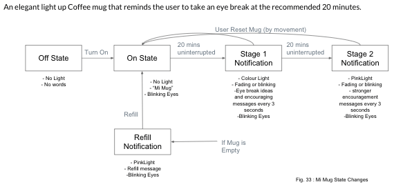
We also looked at the eye health knowledge of the target group where the least known eye health advice was also one of the most recommended from professionals - the 202020 rule:
Every 20 minutes, look at something 20 feet away for 20seconds.
With these findings and the health advice to focus on, we moved on to refining the problem statement.
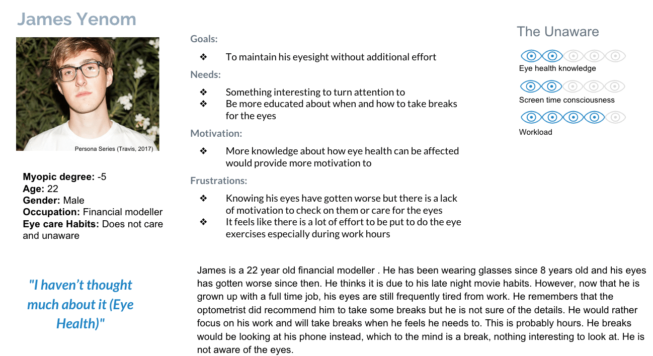
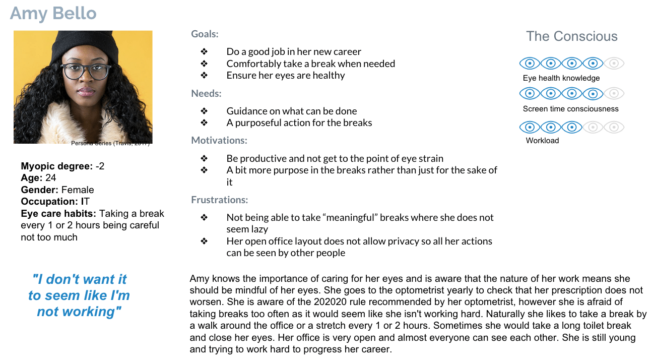
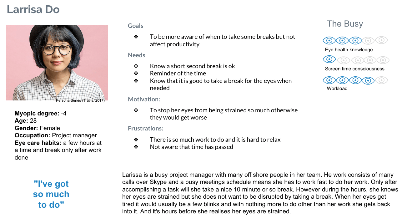
The research insights were also synthesised into 3 persona archetypes that represented our potential users: The unaware, The conscious, The Busy
After the research which allowed us to decide on the focus of our project and narrow down the scope, we redefined the problem statement to refine our goals for the following stages.
How can we empower young professionals to take more breaks for their eyes during computer use?
Focus Group: Young Professionals Aged 20-30 years old
Health Concept: 202020 rule for the eyes - Every 20 minutes, look at something 20 Feet Away for 20 seconds
Usage environment: Office and Home where users spend many hours at a time with computer screens
Needs Focus: screen time awareness, reduce guilt, encourage the 202020 rule, encourage breaks for the eyes
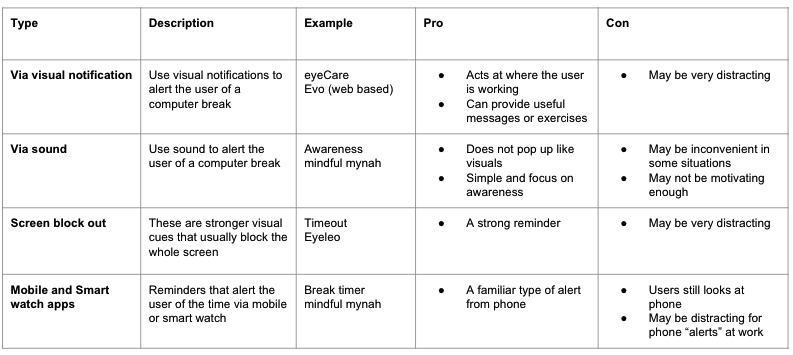
We searched for existing solutions and designs that reflected our problem statement. The strengths and weaknesses of each were analysed and summarised below:
On a large sheet of paper we first put out problem statement and research insights in the centre. The insights were the ones we felt would be most helpful in generating ideas in regards to the problem statement.
Then did some quick brainstorming where we wrote that as many ideas as we could with the help of random word and picture generators. The focus was on quantity rather than quality. Then we explained each idea and grouped the ideas that were similar. Further discussions were had and new ideas added to the mind map.
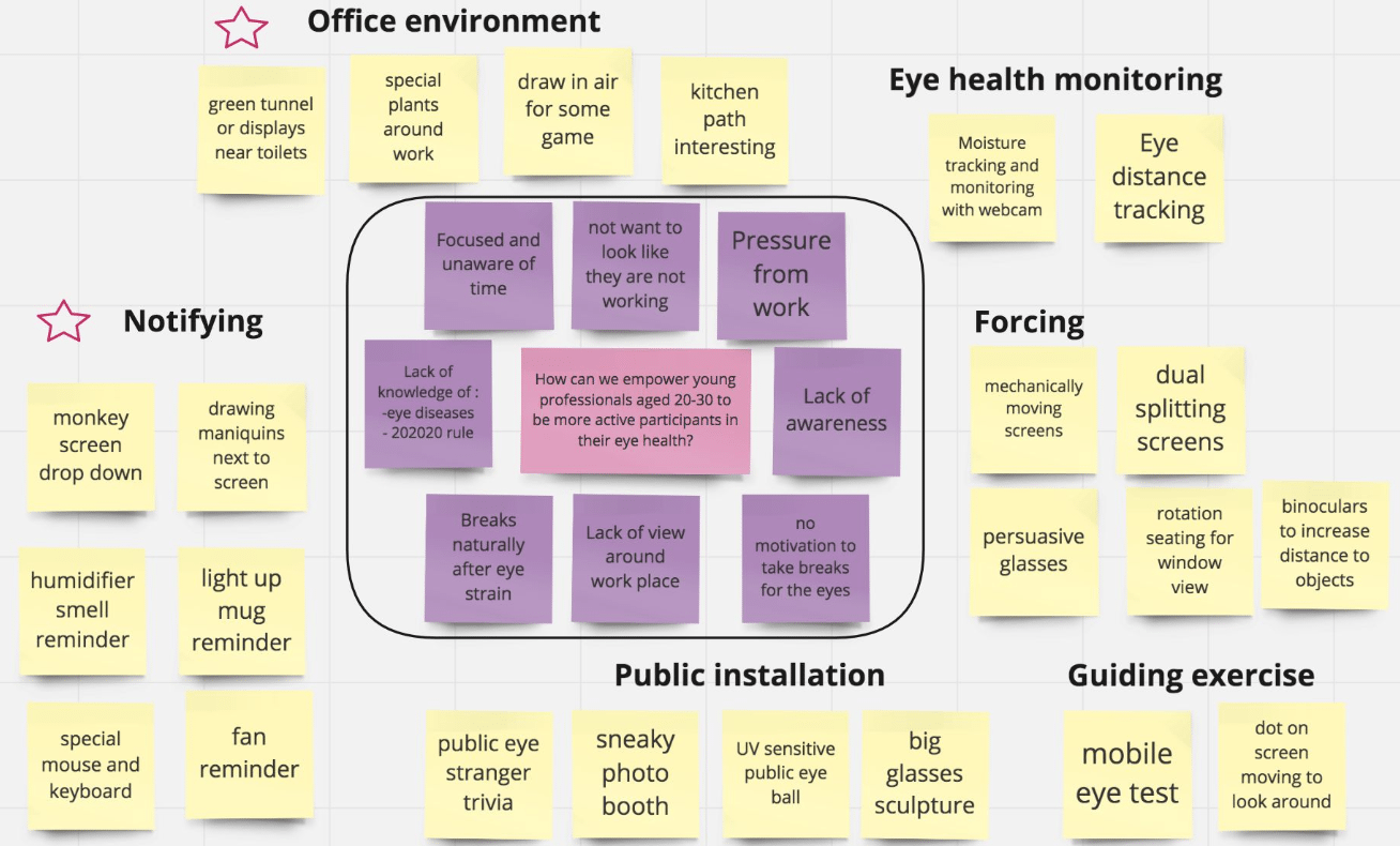
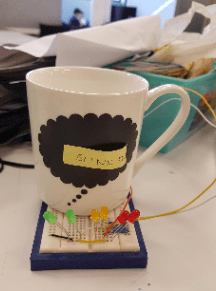
From the ideas, 3 ideas were chosen to be discussed further and storyboards were drawn to evaluated usage of the item against the personas. The Concept chosen was called "Mi mug". Below is the initial concept:
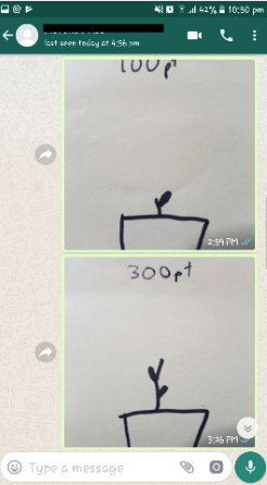
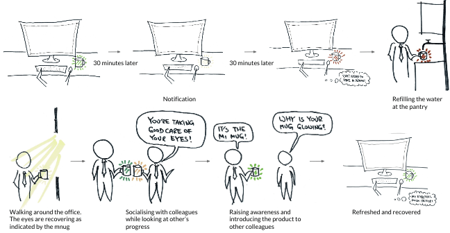
"Mi Mug is a beautifully designed mug that reminds the user to take screen breaks by emitting colours that signal to drink, break, refill or have a chat. A companion app shows the encouraged actions helps grow a virtual garden – drinking, refilling, mug cheers, sunlight."
We drew a storyboard to convey the concept and it's interactions:
The idea was chosen as it meets the user needs (defined previously):
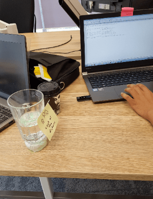
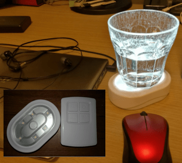
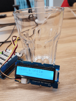
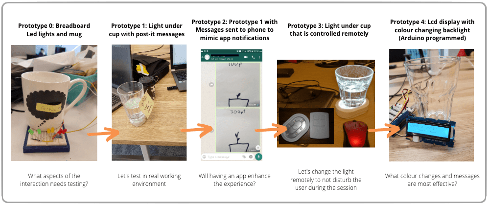
Prototypes of the concept were then built and tested. For each prototype we tested it with 2-3 people and gathered findings from observations and a semi-structured interview. The findings then translated to questions and design suggested which we tested in subsequent iterations of the product. Each prototype aimed to address specific questions we had about the design and concept.
In summary we answered the following questions:
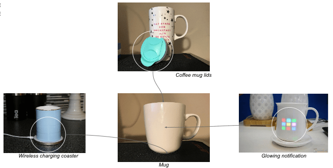
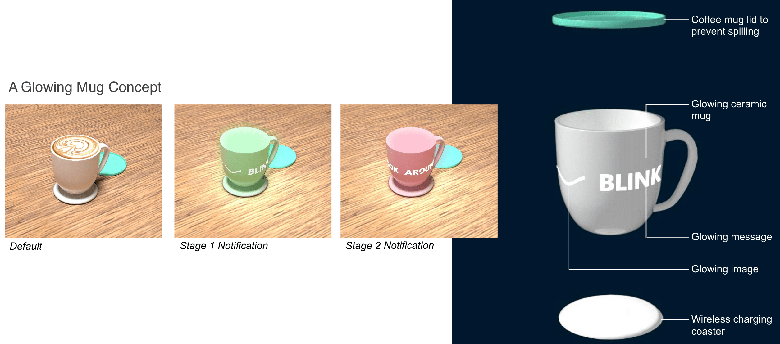
We then researched various existing technologies and mugs which we integrated to design the look and feel of our mug.
As an introduction to design thinking, this project enabled me to put the theory learnt into practice.
I gained experience synthesising qualitative data using techniques such as affinity diagrams and uncover user needs. I then got to experience brainstorming and evaluating ideas based on an understanding of the user's experiences and motivations. I was surprised of the simplicity of our chosen concept which we found met more user needs than some of our more fancy and complex ideas. So a good design can be very simple but thoughtful when taking into account the right things.
For the prototyping I was surprised at how much it can change and how useful it is to involve participants to test your product and find answers to hypotheses. Of course there were limitations of what could be made and tested but using the materials and technology we had available still allowed for testing how well a concept could be in real life. A partly functional prototype could be very useful and be used to test for specific features or questions we had about the design of the product and interactions.
Our team worked well together throughout. Some steps we took that ensured good team work included: agreeing on set times to meet, knowing each other's commitments, understanding each other skills or areas of interest to divide the tasks and having an open communication channel (whatsapp in our case)